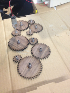
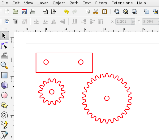
Here we have all of my cogs cut out and spaced so that they are transfer torque to one another.
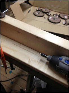
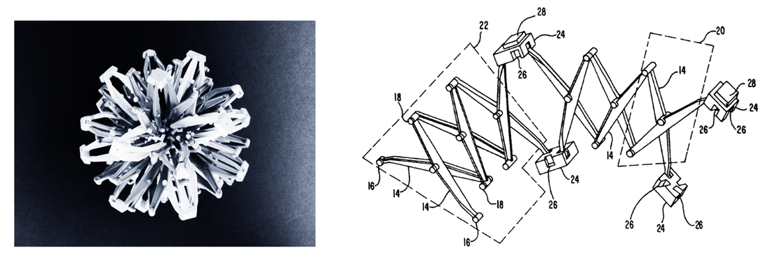
From this point I took the distances between each cog and rearranged them into a more dynamic pattern, and began to work on building the encasement. The material I had on had for the clear case was only .05" thick, which meant I got to play with hand routing (or dremeling) a dado out of my pine frame. much fun and sawdust was had by all.
Along the way I checked that all the alignment was properly spaced so that the cogs would spin freely when attached to the gear motor.
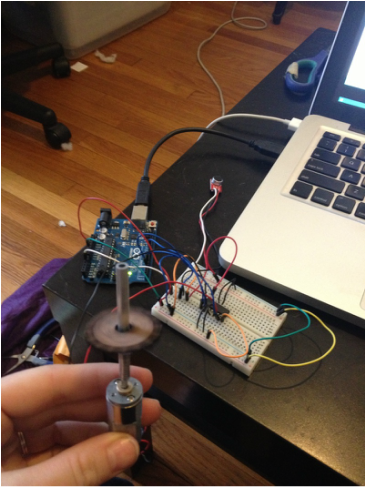
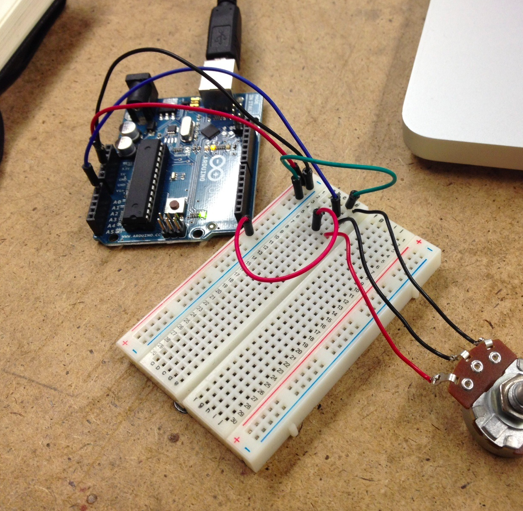
On the other side of things I wanted to have my arduino trigger the start of the motor movement through sound. Here's a test of sound triggering a temporary servo motor.
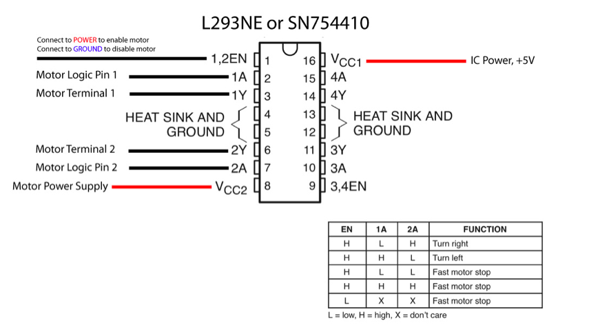
From there I switched over to a gear motor and an h bridge for more torque.
current list of materials: Breakout Board for Electret Microphone 1 @ $7.95 Arduino (owns) 1/8" sheet acrylic (to be laser cut) $12-20 gearhead motor - $12.95 continuous rotation servo motor (owns) speaker (owns)
after roaming around the internet and chatting with the screambooth creators, I decided to try out this microphone from sparkfun as my audio sensor. I was warned of some difficulties with it being a bit too sensitive, but as I'll be using it for a nearly silent environment, I'm hopeful enough to give it a try!
I'm been thinking a lot about mobiles. This may be in part due to a sudden onslaught of baby friends, but I've also always been interested in their movement and graphic qualities. However when it comes to babies very few of the mobiles on the market have any particular value other than being "cute". mostly contain a half dozen stuffed toys hanging in a circle. I'm interested in creating a mobile for a baby that has movement and may or may not have light and sound elements. I would also like to attempt an on/off triggered by crying. Most of all, I would like to create something with ageless graphic appeal and incorporate mechanical movement. the mobiles by Alexander Calder are a source of inspiration for their elegance and simple color schemes.
I'm not necessarily aiming for something that has primarily adult interest, but something that can be playful and generally a step or two more aesthetically pleasing than what's generally available. These sheep are a nice balance between simple graphics, and something that's even slightly more refined. I'm also interested in integrating more mechanical elements. Some inspiration for the movement may be pulled from Hoberman's sphere in addition to more/other visible cogs and mechanisms.
Theo Jansen is completely incredible.
Team 'e cubed (e to the three)) continues to march on towards midterm! Most of the fantastic documentation can be found on emily's blog: http://www.argonautplanet.com/itp/physical-computing-midterm Where this week we added our Bill of Materials, updated systems diagram, sound sample, FLIR experiments, and beginning progress with mapping analog pulse sensor data into our fireflies! Additionally, here is the video of our current progress with motion triggering video. In the user raised a highlighter into the camera's view it will trigger footage of a bird flying away. Hopefully with continued work we can integrate this video with our forest scene, and possibly trigger a series of birds in flight.
In this week's lab we used an h bridge for the first time. As seen in the chart below, the motor's direction is controlled by the two motor logic pins (1A and 2A). For our lab we also included a switch input, and programmed the board using a simple if statement to change the HIGH/LOW setting of the motor logic pins based on whether or not the switch was pushed.
This week our lab focused on gathering analog values (in this case from our potentiometer) and importing those values into Processing in order to have a visual representation for our changing values.
Here’s our basic potentiometer setup. The center pin is inputting value into the analog A0 pin. That information is then sent over to Processing.
The command: import processing.serial.*; is used to call the serial library in Processing and the line ” Serial myPort” declares a variable named myPort from class Serial.
inByte is the variable that will hold the incoming values from our analog source (our potentiometer). We can then use this variable to both print out the numeric value (ranging from 0 to 255), and we can use this variable in a range of visual outputs. In this function I have circles of different colors display based on the incoming analog values. Values 0-100 produces a black circle, 100-150 produces a range of blue circles, 150-200 a green circle, and over 200 a red circle. Here’s the video! and…a beautiful pair of cutler and gross glasses.
Let's start with servo! Here I have a force sensor as my analog input acting as an input into my servo. I mapped the values of the sensor from (0,1023) the range of values that the sensor gives us - to (0,130) a range of values that is understandable by the motor. As I learned later - I was not using a standard servo motor, but rather a "continuous" servo motor. This meant that while I wasn't able to trigger movement to controlled angles I could get smooth continuous motion.
So taking that I decided to try and make my first moving robot! I added an additional force sensor and servo motor, and attached some little wooden wheels to the servo spokes. Of course, because I wasn't able to change the direction of the servo without hacking (another future project!) my little robot friend can only spin in circles.
I’m really excited by the mechanical pixels. Having been to a couple of student shows over the past couple of years, I find that the pieces I’m most drawn to are those that are aesthetically pleasing, and/or beautiful objects, and all the better if these beautiful things can also inspire a sense of wonder, or playfulness. For example, I find Rozin’s series of mirrors to be completely magical. With the other mechanical pixels piece “waves of leaves,” I found myself wishing they either had less of a direct and fluid response (more rapid and random movement) or a higher degree of responsiveness (like Arjo’s Coustaeu piece). Although I did wish for a somewhat different interaction with the ceramic leaves, I thought the execution was truly lovely. Honestly, the things I’m least draw to are Theremins. Making crazy sounds is just really not my scene.
In general I think the weaker pieces are those that feel like the beginning of a good idea. For me some of the pieces like “set in stone” feel like they’ve started on an interesting path, but I find myself wondering - “how can we do more with this?” whereas I would say the more successful pieces feel fully realized.
The interactive dolls are something I’d seen in the ‘furby’ toys, or the computerized baby dolls I had to take care of in my highschool health class. I still really enjoy their interface, and their capacity for playfulness, but for some reason they’re not my first preference. Similarly the ‘multitouch interfaces’ - was something I’d previously heard discussed in a lecture by Clay Shirkey in the form of the “mud pit.” I’m hoping to explore a kind of “common object” that can be used as an interface- not so much in the painting with your finger or sculpting with mud realm, but more a common object that retains it’s properties even in the light of a new interactive use.
This is something that I generally think about with any object in my life, and in fact most of my adult working life has been focused around this concept: how good looking is this object? Of course this article is not about aesthetics alone, it’s about the merging of aesthetics with usable or “natural” user design. That this article was written before the rise of the apple empire is fairly evident, simply because nowadays any conversation taking place about the importance of an elegant and simple interface practically requires a mention of the mac or iphone. It did seem to me that the trade off between user control and the complexity of a design wasn’t something that Norman spent any time talking about. While I completely agree with him that there are many, many objects in creation that exhibit awkward or non-intuitive design, I would also argue that there are times when a watch or alarm clock’s simplification may just mean that the user no longer has access to a control they may desire. But here is where people should also take some responsibility for understanding the kinds of objects that they invite into their lives. The most complex form of an object may not be the one that will be most beneficial to you as an individual. With that out of my system, I really enjoyed thinking spending some time thinking about his statement, “affordances provide strong cues to the operations of things.” The concept that wood is for writing on, and not for smashing like glass, is completely accurate, and something I hadn’t actively thought about before.
I took a look at our very own local elevator for thinking about user/object interaction. I would argue that the main/lobby elevator button is in general one of the more problematic user interfaces that many of us deal with daily. Here at NYU, the initial up or down button, when pressed, is extremely difficult to see, so people have to both be quite close to it to be sure it’s lit up, and frequently feel the need to push the button multiple times to make sure “it worked.” A larger, more visible light up arrow would make it clear that it had been pushed without closer examination, and if it were to blink, or do something other than remain on, the person waiting may feel like the elevator was “doing something.”
Another opportunity for improvement comes inside the elevator, where people will often stare up into the air, craning your neck to watch the floor number light up. Even so, people will often step off at the wrong floor if the elevator stops before their expected destination (often the lobby.) I considered that if each floor had a different note/tone that it made on each floor people might be more aware of which floor hey were on without having to dedicate all of their attention to a series of lights.
In thinking about the “naturalness” of various user associations Norman mentioned, I thought that perhaps the lower floor could have lower notes, and the higher notes would “naturally” indicate a higher floor. And since many of us travel most between one floor and the lobby floor, there could be something distinctive, perhaps a two -tone dum-dum that seems to communicate a final rest, when you’ve reached the ground floor. If the people waiting in the lobby were similarly able to hear these sounds, they would also have a general idea of where the elevator was without craning their necks up to watch the progress (or non-progress) of the elevator.
Video!
I spent some time hanging out with my breadboard today, and together we made some switches do just what they wanted to.
The switches I used here are “normally open” meaning that their connections are open/not touching, unless they are are engaged. Despite the fact that these two setups use the same type of switch, they can be used in significantly different ways by altering their wiring.
In this arrangement the switches are all “parallel”, meaning that if any of the switches are pushed (closing their circuits) it will complete the circuit and turn on the LED.
Whereas in this arrangement the switches are in a series, (there are no wires that will by step the other two switches) so all three need to be pressed in order to turn on the LED. Another switch variety is the potentiometer! Unlike the previous button switches which were only capable of ‘on’ or ‘off’ functions, the potentiometer is an analog interaction. It has three connections, and as the knob is turned, the outer two connections adjust resistance to the center wire, which in turn dims or brightens the LED.
I agree with Bret Victor’s concerns about the “numbing” of one of the most vital natural assets in the human body - the hands. His point that the best tools are ones that are fit to both the task and the method of use is similarly mentioned by Crawford when he states “good interactivity design integrates form with function.” Using a single finger, without any kind of texture or weight indicators, makes for flawed interactive design. I do think it’s important to keep in mind Victor’s acknowledgement that the touch-screen technology that he’s faulting in this article is in fact a solid transitional step between a non-interactive screen and a future that may take better advantage of the skills our hands possess. I frequently feel that arguments citing the flawed nature of the current technology/system/society fail to take into account that improvements and changes to the world around us require ongoing work and necessitate “middle” steps that may not be perfect solutions.
In this video what Microsoft is attempting to do is to impart a sense of wonder, and fluid ease with which technology can be integrated with every aspect of normal life. While I agree that a world of touch-screens may not be the best option, it’s important to keep in mind that this video requires “advanced technology” that is instantly understandable by the viewer, and may not therefore be able to radically redefine what we understand to be attainable technology in the span of a consumer directed commercial.
I do find Victor’s concerns to be interesting however. This is a concept that I had previously only thought of in the context of e-readers (a technology I find myself wildly uninterested in because of the tactile elements missing from an *actual book.) Having worked as a sculptor, I’m aware of the fact that it is frequently your hands, and not your eyes, that are the most perceptive tool at your disposal. When creating a rounded surface for example, your sense of touch can instantly perceive imperfect places on a sphere that your vision may not be able to pinpoint beyond a vague sense that something is “off”. I’m decidedly interested in seeing new ways that interactive technology can better utilize our hands, and firmly believe the use of the full body will be a continuing trend for increasing the success of interactive technologies.
|